Hi there,
In the previous email this is how I explained a funnel to you:
A good funnel takes your audience on a graceful and beautiful customer journey. People go from hearing about you to learning more and trusting you. They opt into your email list and decide to buy something from you for the first time (usually a cheaper course). They start buying more expensive courses and finally, they become loyal, returning customers.
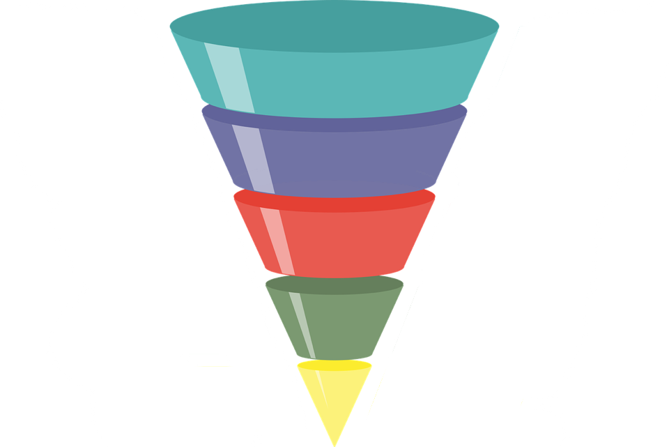
That’s true. And it’s really nicely explained (or at least I think so). Maybe it sounds like it would lead to a super organised funnel. Like those ones you see in blog articles about funnels:
|
|
|
|
|
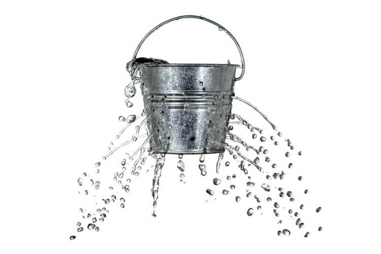
But, in reality, most people’s funnels look something like this:
|
|
|
|
|
They’re pissing out money left and right. They’ve got so many holes you can’t believe and are nowhere near as neat as the first picture. If you watched any of my webinars, you probably saw these two pictures, I really love using them to explain imagination vs reality.
The question you probably have right now is:
If I have a funnel #2 how do I make it look like funnel #1?
Which hole should I fix first?
Well, in my opinion, the best answer is - the one that will bring you the most money.
But, how do you figure that out?
You look at numbers.
First, you must know your numbers for each stage in your funnel. Then, you must know the benchmarks. When you compare those numbers, you will see what you need to optimise.
The best decisions in marketing are the ones that are guided by data. We believe in that so much we’ve put it into our company name.
I’ll explain in another email how you do that calculation, and then decide what to work on first.
Thanks,
|
|
|
|
|
|
|